The Art Of Designing A Great Logo
It doesn’t need a professional to tell you that your business- no matter what it is- needs a logo. A signage, a trademark, a symbol, anything that differentiates your products or services from others. It’s the first step towards building your visual identity.
It is the first thing your audiences see about your brand and is therefore a very important communication tool. The logo of a company can make or break its business. As the businesses are penetrating more personal spaces these days, your means of communication needs to be more inclusive and well-thought-out. Including your logos! It is the first thing your audiences will notice about you and will use that to identify you when they see you.
So, naturally it’s a very important tool for your business. And to help you design a great logo that represents your brand perfectly, here we have a step by step guide to designing the perfect logo!
1. Understand Why Your Brand Needs A Great Logo
Your logo is the first impression your brand leaves on your audiences. And you know what they say about first impressions and their importance, right?
It’s the first touchpoint your audiences have with your brand. It’s how they will perceive your brand, virtually communicate with it, decide if it stands out from the others and strategically speaking, it is what will make them interested in you. Customers more often than not base their judgement of you on your logo. It’s how they decide if it’s the right fit for them or not. And that is the reason your logo needs to be impressive.
We mean, if you’re going to stare something in the face and have it stare back at you, it better be attractive, right? Otherwise, what else is there to make the customers swipe right!
2. Know And Understand Your Brand
A logo designer is a lot like a stylist. It is responsible for dressing up your brand, making sure it looks its best. But before they can do that, it is very important they know the ‘person’ that they’re dressing up.
Take a moment to stop and reflect on the personality of your brand. Define in clear terms who you are, what you stand for and what is so unique about whatever it is that you offer. Know why you started the brand, where you want to take it and why do people need you? These might seem like life altering questions (and trust us, they are. But that’s a different blog altogether!) but these questions are very important in describing who you are as a brand and ultimately have it reflected in your logo. A comprehensive understanding like that will help you design a logo that will compliment and complete your picture.
3.Get Inspired And Design To Impress
One of the most important steps in the logo design process, and arguably the toughest, is the inspiration step. This is the part where you’re trying to put two and two together and make sense of everything.
Your involvement in the brainstorming process is just as important as your designer’s. Pay attention to your surroundings for it could give you ideas about symbols and signs you could use in your logo. The design, color palette, fonts, everything is very easily available around you, you just need to see it. It doesn’t have to be anything material, it could be as simple as pinning down ideas about what you want your brand to look and feel like. Don’t worry even if it sounds like a terrible idea. You never know when something bad could lead to something genius!
Always think from the outside. Like how you would want your customer to feel like when looking at your logo. Remember what would be important to them and what will make them stop and look. Lastly, don’t be scared to get more people involved. Partners, colleagues, business associates- the more perspectives, the better!
4. Research
Next up- research, research, research! We know it sounds boring but hey, you gotta do what you gotta do! Your competition is also the best place for inspiration and ideas. Browse through what’s already out there, what’s working for your competition and their audiences. It will also give you an insight into what’s not and you’ll be able to learn from their mistakes. Think about the ways you can make your brand stand out. Be different!
And while you’re at it, think about the style as well. Whether you want to be modern or classic, minimalistic or quirky, formal or friendly.
A word of caution though- in order to be different, don’t turn into a rebel. We don’t mean conform to the cliches and practices of the industry but read about why and how they came to be. And where there’s scope for improvement or doing something “unusual”, don’t be afraid to make an informed leap of faith.
Find The Right Type There are mainly 6 types of logos one can choose from-
i. Lettermarks or Monogram Logos
Lettermarks work great when you have a long or difficult brand name and want to streamline your logo. Brands like H&M, M&S, even businesses like BoF, do it. While these can be a great way to minimalize your logos, they might not always be the most explanatory.
ii. Wordmarks or Logotypes
When you’ve got a great, short name for your brand and want to put it in the foreground, wordmarks could be the best way to do it. Choose a typography that matches the personality of your brand and if need be, accompany it with a graphic.

iii. Pictorial Marks or Symbols
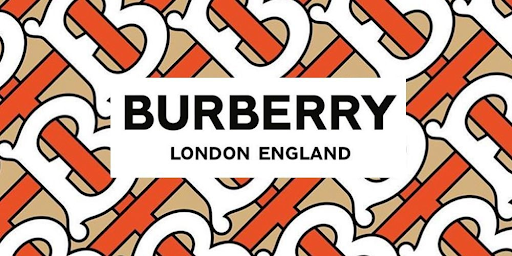
Symbols are usually the first thing that comes to our mind when we think of logos. These are signages or images that give a visual recognition to your brand. They could be simple or complex but make sure they reflect your business well. Often, but not necessarily always, these are accompanied by a wordmark so that the name of your brand isn’t lost on the customers.

iv. Mascots
Mascots are fun, graphic, cartoon-like characters that can quirk up the personality of your brand. They go a long way into making your brand approachable and friendly. They may or may not be fictional. For example, Mr. Sanders on the KFC logo is the actual founder of the brand unlike the fictional dough boy character, the Pillsbury Doughboy, representing Pillsbury.

v. Combination Mark
Seemingly self explanatory and one of the most widely used logo types, combination mark is a combination of symbol and word marks to make a comprehensive logo. These elements can be used together to create a stronger brand association or used separately, it will a very powerful brand association. Example Disney or McDonald’s.

vi. Emblem
Much like combination marks, emblems combine words and pictorial elements in a logo. Often looking like text integrated in a symbol or an icon. Example- badges or seals.

6. Keep It Simple And Scalable
A very crucial step in the design process is to think of the typography and color palette. Colors can have tons of other meanings attached to them. Understand the psychology behind colors and then choose one that will most effectively reflect your brand personality, connect best with your audiences and address the cultural and emotional sensitivities of the market. Don’t be afraid to use a combination of different colors to achieve your goal.
Another unmissable consideration will be typography and font. Use the most effective and comprehensive font to go with the other elements of your logo. Make sure your font doesn’t get lost amongst them but also ensure that it is not overpowering them either.
Once you have all these details down, work on putting these together to create a logo that reflects perfectly the vibe of your brand. But try to keep your logo as simple as possible. It’s good to include different elements in your design but use too many and you’ve lost the effect you intended for. It should be simple enough, despite use of different elements, that the message is delivered to your audiences in the first glance. It is what makes your logo memorable.
Another key feature of a great logo is its scalability. Since it will be used across multiple platforms and in different proportions, make sure your logo looks good in all shapes, sizes and forms. From being on a huge billboard to a small letterhead.
7. Try Out Different Versions
A very important consideration when designing a logo is to test it out in different versions of backgrounds and colors, especially black and white. Your logo will often be integrated in collaterals with backgrounds different than your own, so test out your logos for PNG versions, colorless or black and white versions.
Never forget to keep in constant touch with your designer. Be as involved in the designing process as you can be. The more, the better. And communicate. If you don’t like something- say it. If you want to experiment with something- say it. Remember, this is how your brand will be seen and perceived by others from the outside, they should feel compelled as well as comfortable enough to approach you.Evaluate your options before coming to a conclusion and when you do, integrate it throughout your brand.


